Research
Introduction:
The sole purpose of a business is to earn money and by providing promotion and advertisement a company or T.V producers can help spread awareness of their product. Without promotion a product would be extremely under viewed meaning it would only be seen when buying the product therefore would be less likely to buy it. Advertising is used solely to expose the product however it also helps to remind existing fans/costumer product or an extension to the product can be bought whether it's now or in the near future. Additionally advertisement makes potential customer more aware of the product and is an easy way to help the viewer decide if they wish to purchase it meaning ad advertising could cost a business great amounts. Not only are adverts used to spread awareness of a product but are also a good way to increase the knowledge of it within an advert there is sometimes a method called logos which uses facts to help sell a product.
I will be analysing two T.V adverts to explain and understand why they were chosen and what they intend to do to. This will help me to understand what is needed to make a good advert and how the theory of adverts is applied in the industry. Furthermore my research should inspire ideas that I will use in my own advert.
Moving image advertising:
Section 1:
Section 1:
Advert 1, McDonald's, 2018 UK Breakfast Ad, Titled Hen.
Advert 2, Heinz Mayonnaise, 2019 UK.
Target Audience and Narrative of Advert 1:
The McDonald's advert follows the car journey of two juxtaposing Hen parties, in one car the group is laughing and singing along to a diegetic song creating an all round excited atmosphere. Whereas in the second car the same song only be faintly heard and most of the passengers appear to be asleep and the character in the passenger seat un-enthusiastically offers flapjack creating quite a dull and sombre tone. Then it cuts back to the first car where the character in the passenger seat sees a McDonald's sign and says she has an idea then both cars are seen going through the drive thru and passing clearly visible breakfast food around. The atmosphere in both cars matches each other creating an all round joyous tone then it cuts to the two cars driving away with McDonald's logo appearing and the slogan " We Make Breakfast".
I think that the advert is targeted towards the age range of 18-40 and mainly women. Not only is this because the actors all fit this description so the target audience can easily relate to them but also the plot is a very typical reason why many adults get a McDonald's. The situation the characters find themselves has probably happened to many adults and reminds the audience of happy times and experiences they've had. Whereas a younger target audience would respond better to less mature themes or more easily accessible knowledge explained in simpler terms. Also because it was a T.V advert that featured on a variety of channels it was easily viewed by the the demographic mentioned previously. The production crew in charge of the advert possibly choose to target adult women because they are very frequent consumers of the fast food restaurant whether it's to treat their children or just the most convenient choice for active and busy adult.
Target Audience and Narrative of Advert 2:
The advert begins with a bus going through a city with a narrator also known as the voice of God speaks over the image. Then the audience views the inside of the bus the focus is turned to a young woman who goes from absent mind-idly looking out the window to her focus being completely mans hair, who is sitting in-front of her. As the voice of God narrates the woman's thought process she suddenly appears transfixed on the hair as the narrator says the word "chips" the image suddenly changes from the mans hair to a bowl of chips. Then a singular chip is picked up and dunked into mayonnaise and the jar of Heinz is clearly visible in the fore-ground of the shoot. As the scene continues the chip is seemingly heading towards the viewers mouth as suddenly the bell on the bus rings sending the woman back to reality where she is sat on the bus with an imaginary chip half way to her mouth. As she laughs to herself the camera pans round to the outside of the bus where the audience sees a Heinz logo and the slogan "Makes it Better".
I think the advert is targeted towards the middle to lower class and with the age demographic of 15- 30 year old. With the main set being a bus which is public transport I believe the producers were trying to relate to the younger generations and not the higher class. The majority of the people who use public transport are normally people who can't drive whether that's because of the them not being old enough or not being able to afford lessons or a car. Also the advert takes place at night giving the impression the character is returning home although we assume she doesn't have a middle class job as she's wearing casual clothes or she hasn't been at work at all which is easily comparable with either youths who tent to be unemployed or the lower class who tend to have low paid jobs.
Compared:
The adverts use very different methods to attract their target audience despite not having that much of a different demographic. However both tell a story and rely on their narrative to entice their audience whereas advert 1 tries to relate to their target audience advert 2 uses humour to persuade theirs because of the audience being slightly younger. Comedy is an easy way to be remembered by a teen audience if they find entertainment from the advert they are more likely to with hold the information of the product.
Section 2:
Mise-en-scene of Advert 1:
The first setting of the scene is a of a row of houses with two cars sat behind one and another with the sky appearing gloomy suggesting either the end or start of a day. Within the first car the character sat in the passenger seat is wearing a brightly coloured fluffy jacket, hooped ear rings and has bright purple eye shadow on making her stand out and the use of bright colours has connotations of happiness. This character then passes a veil prop to a character in the back not only does this add to the characters perception of being "the life of the party" but also tell the audience that the group is celebrating a upcoming wedding. In contrast in the second car there is the use of the prop of a pillow to suggest boredom and tiredness creating a completely juxtaposing atmosphere. After showing the audience the two settings of each car the camera then changes to a long shot which focuses on following the two cars to reestablish the shot to show the movement of the cars and also show the audience some time has past as the sky appears brighter than the first shot. Then the character that the audience has already established to be the "fun one" suggest going to McDonald's as the audience can now see the sign because the frame is positioned so that the sign is seen through her window this now allows the audience to understand which company the advert is for. Again the audience gets a reestablishing shot which shows the cars going through the drive thru and the time of day has once again moved forward. The focus of the camera is then on the second car as food is being passed around showing the juxtaposition of their body language and facial expression from the beginning of the advert. Whereas in the beginning they appeared to be asleep and drowsy now they are sat upright and appear excited and more energised.
Mise-en-scene of Advert 2:
The advert starts with an establishing shot of a city at night with house and street lights adding soft glows creating a very picturesque setting. The setting on the bus appears slightly gloomier with only the colouring is slightly darker with an added edge of discomfort by having people moving to seats making the bus more cramped. Then the focus is on the main character who is wearing a bright yellow top which signifies happiness and draws more of the audiences attention to her. As the focus is drawn to the mans hair which is styled to be spiky looking accompanied with the bright and unnatural colour makes it stand out but is also used as a prompt to make the main character think of chips. His hair is used to move the plot along to a new setting which is assumed to be a kitchen because of the use of the props a table, a microwave, coffee pot and cook books that can all be seen in the background. Within this setting the focus is mainly on a frame which is positioned so that the jar of Heinz mayonnaise is on the fore ground drawing most of the audience attention to it with the chips and the actual mayonnaise is in the background. The kitchen setting is dark with only the food appearing to be lit up making the food appear seductive to the presumed hungry character and drawing the audiences attention to the food even more. When the camera returns to the bus the frame is positioned so that the character is the only person clearly visible ensuring the audiences attention is on her so that can deliver the humour intended for the advert. When the logo appears the background setting appears quite dark again so that the logo appears to pop off the screen drawing the focus of the scene.
Compared:
The mise-en-scene of the two adverts is different and giving the effect they wanted. In the first adverts the colours were bright and welcoming luring people outside and to their closest McDonald's. Whereas the second advert used dark blues and black to make the setting appear cold and making their audience feel homely and want to stay inside. The two adverts give a different affect because of their needs to sell a product for example McDonald's is more accessible from a restaurant meaning people will most probably have to leave their houses to have it.
Section 3:
Sound used in Advert 1:
The advert starts with the use of very common diegetic sounds such as people chatting, laughter and a car horn which gives a sense of reality to the setting and also helps the audience to see the relationship between the characters. Slowly the song fades in and is non-diegetic however when the audience is watching the first car it's loud and competing with the sound of the characters voices and laughter. However when the focus is on the second car it is quieter and seems faded making it the main sound in the scene, with the only other one being a slight snore. Which adds to the juxtaposition of the two cars one competing for audiences attention by showing outgoing personality whereas the music is the only thing heard in the second car. The volume of sound reaches it's climax when the McDonald's sign is first seen then as the characters get their food the music is competing with the happy chatter of both cars suggesting an all round happy atmosphere after getting the food. Leaving the advert on a happy and party-like atmosphere ensuring the audience is in a good mood once they've seen the advert.
Sound used in Advert 2:
Advert 2 has a great use of sound through the voice of God narrating the whole advert the voice is softly toned and well spoken personally giving me connotations of a story being read. Additionally the wording used such as personifying the bus "as the number 57 bus crawled down the hill" sounds like a children's story making the bus into a character. The narrator is also important for highlighting which brand and product the advert is promoting because although the product is in shot quite clearly, they can't just rely on their audience to see the product. Also when on the bus in the background, talking can be heard to add a sense of realism however as the main the character focuses on the mans hair the talking is faded out as music is faded in. The music used as the setting changes to be in the kitchen is soft and slow and gives the audience a sense of relaxation. Additionally the use of a bus bell to snap the character back to reality is well chosen with the atmosphere but also is a sharp and audible sound.
Compared:
The sound used in Advert 1 is more realistic and tell the narrative through the use of music and the dialogue used creating the overall atmosphere. Whereas the sound Advert 2 is explicitly tells the narrative to add to the dreamy state of mind the character is in and guide audiences into the story. However both adverts use background noise to create a sense of realism which is important so that the audience doesn't switch off and get bored of the advert.
The sign used at the end of the advert, the MacDonald's logo and then the slogan We make breakfast is presented in front of the two cars driving down a lane. The McDonald's logo is known by the audience because of the brands popularity which means that despite the fact the word McDonald's isn't written out the M used has well known connotations for being the logo for McDonald's. This sign is very important for the advertiser as it's a simple yet effective way to show the audience which brand is being promoted. The slogan used "We Make Breakfast" also shows the promotion being done more specifically because the advert is not just promoting the brand but also the fact that McDonald's serve breakfast. The company probably choose to promote their breakfast service because of the lack of costumers using the restaurants in the morning so this sign is also important to influence more people to eat McDonald's breakfast.
Signs in Advert 2:
A sign used in advert 2 to me was the use of chips although the product the advert is selling is the mayonnaise a lot of focus was put onto the chips. When displayed the chips are positioned in the foreground and well lit ensuring the audiences focus is on the food product. For a sauce company it is very important to match your product with an item of food that is very popular in order to sell. This is because sauces in every day are paired with another product it's very unlikely that any of their target market is eating mayonnaise on it's own. By having a well liked food such as chips to market the sauce with it makes the product seem more attractive. Chips have connotations of a being a treat to many people and on the most a food many people enjoy.
The advert starts with a long shot to establish the scene for continuity purposes and throughout the rest of the sequence long shots are used to reestablish the scene as they are in cars constantly moving. This shot starts by pointing at the row houses where the women are emerging from but zooms out and pans slightly to the left following them to the cars suggesting to the audience that these are important characters to watch. In the two cars there is a juxtaposition in the camera work, in the first car the shots change going from a medium close up of the front passenger then to a medium shot of the characters in the back seat, then back to the medium close up of the front passenger. Whereas in the second car starts with a medium close up and only changes to a medium shot the second time the audience see's the car. The quick cuts in the first car suggest the scene is fast and quick paced equally the use of very little cuts in the second car suggest that nothing is happening that is interesting to the viewer.
Shot types in Advert 2:
The advert starts with an extreme long shot of a city landscape to establish the setting with the bus barely visible in the frame. As the scene moves to a different setting (the bus) another a reestablishing shot is done of a medium long shot so that the audience can take in the fact that the sequence is set on a bus. The camera then cuts to a close up of a passenger highlighting to the viewers her importance this shot is also used so that the audience can visibly see her facial expression change. In the sequence which follows the cuts are quick signifying her quick thought process which links the mans hair to chips. Although the kitchen scene isn't very long the cuts appear drawn out and are slow paced allowing the audience to easily absorb the information about the product. The slow pace of the kitchen sequence is matched by the music and atmosphere of the scene.
A key technique used in Advert 1 is pathos the producers are trying to make a connection to their audience through emotion. The intention of the advert is to entice their audience by bringing back memories of happiness shared with their friends. The unity the characters share in the advert by their singing, laughing and joking will remind viewers of their own friendships stirring emotions. If an advert has an emotional effect on the viewer it's more likely to be remembered hopefully luring them their closest McDonald's because subconsciously in the audiences mind it's a place of happiness. Also in the advert there is a slight use of logos by providing the McDonald's breakfast serving times. It could also be argued when a McDonald's product is shown in the advert that is also a use of logos because it gives the audience an idea of can be obtained at a McDonald's.
Advertising techniques used in Advert 2:
In Advert 2 the producer also uses Pathos as a way to communicate the product to their audience. However unlike Advert 1 pathos is used as a comical aspect attempting to make the audience find humour in the exaggeration of how much the protagonist want to eat chips and mayonnaise by making her hallucinate. By evoking laughter or even just a humorous aspect the advert is more likely to stay with someone reminding them of the advert whenever the viewer see's Heinz mayonnaise making them want to buy it. By using and highlighting the Heinz logo is use of ethos because the Heinz company is very old and very popular in England. Many people just use Heinz sauces because they trust the brand by making very clear it is a Heinz product to many viewers this makes it creditable.
Sound used in Advert 2:
Advert 2 has a great use of sound through the voice of God narrating the whole advert the voice is softly toned and well spoken personally giving me connotations of a story being read. Additionally the wording used such as personifying the bus "as the number 57 bus crawled down the hill" sounds like a children's story making the bus into a character. The narrator is also important for highlighting which brand and product the advert is promoting because although the product is in shot quite clearly, they can't just rely on their audience to see the product. Also when on the bus in the background, talking can be heard to add a sense of realism however as the main the character focuses on the mans hair the talking is faded out as music is faded in. The music used as the setting changes to be in the kitchen is soft and slow and gives the audience a sense of relaxation. Additionally the use of a bus bell to snap the character back to reality is well chosen with the atmosphere but also is a sharp and audible sound.
Compared:
The sound used in Advert 1 is more realistic and tell the narrative through the use of music and the dialogue used creating the overall atmosphere. Whereas the sound Advert 2 is explicitly tells the narrative to add to the dreamy state of mind the character is in and guide audiences into the story. However both adverts use background noise to create a sense of realism which is important so that the audience doesn't switch off and get bored of the advert.
Section 4:
Signs in Advert 1:
The sign used at the end of the advert, the MacDonald's logo and then the slogan We make breakfast is presented in front of the two cars driving down a lane. The McDonald's logo is known by the audience because of the brands popularity which means that despite the fact the word McDonald's isn't written out the M used has well known connotations for being the logo for McDonald's. This sign is very important for the advertiser as it's a simple yet effective way to show the audience which brand is being promoted. The slogan used "We Make Breakfast" also shows the promotion being done more specifically because the advert is not just promoting the brand but also the fact that McDonald's serve breakfast. The company probably choose to promote their breakfast service because of the lack of costumers using the restaurants in the morning so this sign is also important to influence more people to eat McDonald's breakfast.
Signs in Advert 2:
A sign used in advert 2 to me was the use of chips although the product the advert is selling is the mayonnaise a lot of focus was put onto the chips. When displayed the chips are positioned in the foreground and well lit ensuring the audiences focus is on the food product. For a sauce company it is very important to match your product with an item of food that is very popular in order to sell. This is because sauces in every day are paired with another product it's very unlikely that any of their target market is eating mayonnaise on it's own. By having a well liked food such as chips to market the sauce with it makes the product seem more attractive. Chips have connotations of a being a treat to many people and on the most a food many people enjoy.
Section 5:
Shot types in Advert 1:
The advert starts with a long shot to establish the scene for continuity purposes and throughout the rest of the sequence long shots are used to reestablish the scene as they are in cars constantly moving. This shot starts by pointing at the row houses where the women are emerging from but zooms out and pans slightly to the left following them to the cars suggesting to the audience that these are important characters to watch. In the two cars there is a juxtaposition in the camera work, in the first car the shots change going from a medium close up of the front passenger then to a medium shot of the characters in the back seat, then back to the medium close up of the front passenger. Whereas in the second car starts with a medium close up and only changes to a medium shot the second time the audience see's the car. The quick cuts in the first car suggest the scene is fast and quick paced equally the use of very little cuts in the second car suggest that nothing is happening that is interesting to the viewer.
Shot types in Advert 2:
The advert starts with an extreme long shot of a city landscape to establish the setting with the bus barely visible in the frame. As the scene moves to a different setting (the bus) another a reestablishing shot is done of a medium long shot so that the audience can take in the fact that the sequence is set on a bus. The camera then cuts to a close up of a passenger highlighting to the viewers her importance this shot is also used so that the audience can visibly see her facial expression change. In the sequence which follows the cuts are quick signifying her quick thought process which links the mans hair to chips. Although the kitchen scene isn't very long the cuts appear drawn out and are slow paced allowing the audience to easily absorb the information about the product. The slow pace of the kitchen sequence is matched by the music and atmosphere of the scene.
Section 6:
Advertising techniques used in Advert 1:
A key technique used in Advert 1 is pathos the producers are trying to make a connection to their audience through emotion. The intention of the advert is to entice their audience by bringing back memories of happiness shared with their friends. The unity the characters share in the advert by their singing, laughing and joking will remind viewers of their own friendships stirring emotions. If an advert has an emotional effect on the viewer it's more likely to be remembered hopefully luring them their closest McDonald's because subconsciously in the audiences mind it's a place of happiness. Also in the advert there is a slight use of logos by providing the McDonald's breakfast serving times. It could also be argued when a McDonald's product is shown in the advert that is also a use of logos because it gives the audience an idea of can be obtained at a McDonald's.
Advertising techniques used in Advert 2:
In Advert 2 the producer also uses Pathos as a way to communicate the product to their audience. However unlike Advert 1 pathos is used as a comical aspect attempting to make the audience find humour in the exaggeration of how much the protagonist want to eat chips and mayonnaise by making her hallucinate. By evoking laughter or even just a humorous aspect the advert is more likely to stay with someone reminding them of the advert whenever the viewer see's Heinz mayonnaise making them want to buy it. By using and highlighting the Heinz logo is use of ethos because the Heinz company is very old and very popular in England. Many people just use Heinz sauces because they trust the brand by making very clear it is a Heinz product to many viewers this makes it creditable.
Conclusion:
Both adverts are effective by being short and to the point using emotion to keep their audiences entertained. Advert 1 uses a a variety of techniques to sell their product including the juxtaposition between the atmosphere of the characters in the second car from before and after they receive their McDonald's. The producer uses pathos to give the the advert an overall jovial and excited tone reminding the audience of the friendships that have helped make their lives better. Although Advert 2 also uses pathos to sell their product it's used to make the audience feel humorous unlike Advert 1 which makes the audience relate the characters back to their own lives making them feel reminiscent. Advert 2 has used humour to help make the audience remember their product because viewers preferred to be entertained then have a product pitched to them. Both adverts are clear on what products and brands they are promoting and both use their own product placement to allow viewers to remember their brand through seeing the logo.
These adverts will help me to develop my own advert as my idea uses the technique pathos to sell the product. By analysing exactly how these adverts work to effectively sell their product I'm able to apply this to my own idea. I think especially the mayonnaise advert has helped me to learn that a product which can't be consumed on their own do well if you pair them with another food or activity whereas the mayonnaise was presented with chips I'm pairing my product of flour with the activity of baking. I also felt the use of minimal talking and the use of music in the McDonald's advert was very effective in creating the desired atmosphere.
I believe the best advert is Advert 2 because of it's clever product placement and unique narrative idea. While attempting humour the advert also has an underlining tone of drowsiness making the narrator appear like a story teller. The music and night time setting create the dream-like atmosphere conveying to the audience how hungry the character is and also giving connotations of Heinz mayonnaise as being from a fairy tale. The unique approach to a comical advert is effective and I believe the product and advert will remain in the audiences minds. Also the advert is clear on what the product they are selling is even placing the product clearly in frame. Although Advert 1 is effective I think that they tried to fit too big of a narrative into the small advert not making it completely clear what is happening the first time it is viewed. Also there is no product placement until the end of advert meaning it's unclear until that point what the advert is promoting and by which time most viewers will probably be paying less attention.

Advert 1, Alpen, UK poster
The advert suggest to me that it is aimed at adults just on the basis that children's advertising tends to have animation or cartoon elements to entice a younger audience. The peaceful atmosphere of the mountainous setting also suggest that the poster is aimed at an older audience as they enjoy relaxing and the quiet. The advert also has the use of logos by placing the NO.1 in the UK certificate quite clearly on the box, this indicates that it is targeted towards the UK citizens. The advert was found on billboards but mostly placed into women's and health magazines which is great because this cereal is promoted by being a healthier option than most other cereals and the target audience for the magazines tend to be finding quick and easy fixes to a healthy lifestyle. Also the poster shows the food product appealing to make the viewer perceive the food as tasting nice before even trying it.
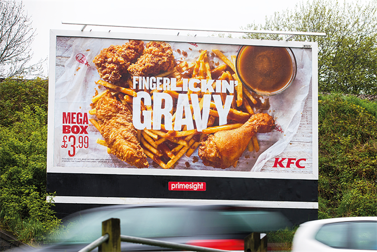
Advert 2, KFC Mega Box, UK Billboard
This billboard is well positioned on what appears to be a the side of the road where many cars will drive by meaning a large amount of footfall allowing the poster to be well seen. The poster shares information about the product such as it's name, the amount the product costs and where it can be bought. Also the brand of KFC is easily recognisable by the use of signature typology used on the poster and also the well known slogan "finger licking" in big bold print. It's important for road side advertising to be easily seen and understood because of the cars typically going past the billboard quickly they may only get a quick look at the poster and not have time to fully register or understand a confusing image. The advertisement team behind KFC made a smart choice by advertising on roadsides because of KFC being a fast food restaurant with a drive thru service many of the costumers will be people travelling in need of a quick and convenient meal. Furthermore the billboard uses the product itself to promote it which is common with food products to show off and entice the consumer. Not only does this technique make the food look more attractive but also clearly shows what is in the meal that is being promoted.
Compared:
I think the KFC advert is better than the Alpen because the KFC advert is easy to consume and gives the information needed to the consumer. Not only is it easy to identify where the product can be bought by the signature KFC logo it also includes important information such as; the amount it costs, what it's called and what it looks like. It's also very easy for the audience to consume as it's bold and doesn't involve a lot of writing even if the a person who is driving by doesn't have time to read the information it is easily recognisable as a KFC billboard so that it's still promoting the company. Whereas the Alpen advert doesn't give any information away which means the consumer doesn't know where they can buy the cereal or how much it costs which means although it promotes the product the consumer then has to try to find somewhere available to them that sells the product. However both advert are well positioned to be seen by their primary target audience resulting in good individual consumption.
My Target Audience:
My chosen product is flour and my AD campaign is based around baking. I believe my target audience would be women with the age range of 45-60 because of the older generation women living traditionally by cooking everyday for their household. Typically I also find that older women enjoy baking as they have more free time and often enjoy relaxing over going out. Where as the younger generation of 16-24 year old's are more likely to buy food product than to make them from scratch because of the easy access which is now available for ordering food products which makes it more convenient. Also because my brand of flour, The Pantry, is a relatively a cheap branded flour as it only price matches Tesco and ASDA owns flour. This means I would also probably aim my advertising towards a lower income class because typically they would pick the cheaper option in a shop. In a recent study which was conducted it stated that 70% of women cook for their household only it appears as an outdated belief it is backed up by data.
Demographic Profiling:
In Survey Monkey I made a survey to help determine my target audience and to guide my creative decision. I believe my survey asks question that are important and well suited to my aim and my product.
https://www.surveymonkey.co.uk/r/93JB3Q6
After getting a total of 32 responses to my survey I was able to narrow down and understand my target audience better. My results revealed that women were the majority that took my survey with 62% which is helpful as I believe my target audience will be primarily female. Secondly most of the people taking my survey were between the ages of 45-54 at 31% which is also inside the age I determined for my target audience however it was closely followed by the ages of 18-25 which was 25%. Although this also could be helpful as I thought this age group wouldn't be my target audience for reasons previously mentioned. From the people who took my survey 46% bake 1-3 times a month which means averagely baking isn't as popular as it has been in the past meaning that an older audience feel nostalgic towards baking. The majority of the people who took my survey had an annual income of under 15,000 with 34% however it was very close with 15,000-29,999 with 31%. This means I'm typically looking at working class citizens as they are the majority. 59% of the people who took my survey said flour was an important ingredient in their cooking. Although it was the majority only 37% said they cooked with their Mothers whereas 25% said they cooked with their children which surprised me as I assumed the majority would be with Both which was only 9%. However this does mean that my idea that baking brings people together and families together still appears true. 68% enjoy heart warming adverts which is what my advert will revolve around as I'm using pathos as my main technique. Finally 65% said they enjoyed cooking/baking which shows my advert will hopefully relate to the majority. My survey showed me that my target audience is primarily women, aged between 45-54 years old in the lower to middle class who occasionally enjoy baking.
Audience Profile:
Gender:
My primary audience would be women as it was the majority in my survey but also my research showed that women are still the majority that cook.
Age:
I will be targeting middle aged women more specifically ranging from the ages of 45-54 as a character in my advert will be this age and the themes I will explore will related to this age group.
Interests:
My target audience will enjoy relaxing, baking and spending time with their families as many middle aged woman does.
Media preferences:
This would mainly be T.V, radio and the social media platform Facebook because this age group tends to stay away from most social media and rarely spends time on YouTube.
Economic Group:
My target audience would be in the C1 and C2 grouping as my advert is meant to engage the mass of society and also someone in group A or B probably don't cook due to busy work lives or have staff members who do it.
Pyschographic Group:
I believe my group is the mainstreamer because my product is very versatile and the masses will need it.
Geographical location:
I will aim my product for the UK because my cast members will be British and all my research comes from British citizens.
Lifestyle:
My target audience will be people who spend time with their families most of my audience will be employed however some may have retired early or are unemployed.
These adverts will help me to develop my own advert as my idea uses the technique pathos to sell the product. By analysing exactly how these adverts work to effectively sell their product I'm able to apply this to my own idea. I think especially the mayonnaise advert has helped me to learn that a product which can't be consumed on their own do well if you pair them with another food or activity whereas the mayonnaise was presented with chips I'm pairing my product of flour with the activity of baking. I also felt the use of minimal talking and the use of music in the McDonald's advert was very effective in creating the desired atmosphere.
I believe the best advert is Advert 2 because of it's clever product placement and unique narrative idea. While attempting humour the advert also has an underlining tone of drowsiness making the narrator appear like a story teller. The music and night time setting create the dream-like atmosphere conveying to the audience how hungry the character is and also giving connotations of Heinz mayonnaise as being from a fairy tale. The unique approach to a comical advert is effective and I believe the product and advert will remain in the audiences minds. Also the advert is clear on what the product they are selling is even placing the product clearly in frame. Although Advert 1 is effective I think that they tried to fit too big of a narrative into the small advert not making it completely clear what is happening the first time it is viewed. Also there is no product placement until the end of advert meaning it's unclear until that point what the advert is promoting and by which time most viewers will probably be paying less attention.
Print advertising:
Advert 1, Alpen, UK poster
The advert suggest to me that it is aimed at adults just on the basis that children's advertising tends to have animation or cartoon elements to entice a younger audience. The peaceful atmosphere of the mountainous setting also suggest that the poster is aimed at an older audience as they enjoy relaxing and the quiet. The advert also has the use of logos by placing the NO.1 in the UK certificate quite clearly on the box, this indicates that it is targeted towards the UK citizens. The advert was found on billboards but mostly placed into women's and health magazines which is great because this cereal is promoted by being a healthier option than most other cereals and the target audience for the magazines tend to be finding quick and easy fixes to a healthy lifestyle. Also the poster shows the food product appealing to make the viewer perceive the food as tasting nice before even trying it.
Advert 2, KFC Mega Box, UK Billboard
This billboard is well positioned on what appears to be a the side of the road where many cars will drive by meaning a large amount of footfall allowing the poster to be well seen. The poster shares information about the product such as it's name, the amount the product costs and where it can be bought. Also the brand of KFC is easily recognisable by the use of signature typology used on the poster and also the well known slogan "finger licking" in big bold print. It's important for road side advertising to be easily seen and understood because of the cars typically going past the billboard quickly they may only get a quick look at the poster and not have time to fully register or understand a confusing image. The advertisement team behind KFC made a smart choice by advertising on roadsides because of KFC being a fast food restaurant with a drive thru service many of the costumers will be people travelling in need of a quick and convenient meal. Furthermore the billboard uses the product itself to promote it which is common with food products to show off and entice the consumer. Not only does this technique make the food look more attractive but also clearly shows what is in the meal that is being promoted.
Compared:
I think the KFC advert is better than the Alpen because the KFC advert is easy to consume and gives the information needed to the consumer. Not only is it easy to identify where the product can be bought by the signature KFC logo it also includes important information such as; the amount it costs, what it's called and what it looks like. It's also very easy for the audience to consume as it's bold and doesn't involve a lot of writing even if the a person who is driving by doesn't have time to read the information it is easily recognisable as a KFC billboard so that it's still promoting the company. Whereas the Alpen advert doesn't give any information away which means the consumer doesn't know where they can buy the cereal or how much it costs which means although it promotes the product the consumer then has to try to find somewhere available to them that sells the product. However both advert are well positioned to be seen by their primary target audience resulting in good individual consumption.
Audience:
My Target Audience:
My chosen product is flour and my AD campaign is based around baking. I believe my target audience would be women with the age range of 45-60 because of the older generation women living traditionally by cooking everyday for their household. Typically I also find that older women enjoy baking as they have more free time and often enjoy relaxing over going out. Where as the younger generation of 16-24 year old's are more likely to buy food product than to make them from scratch because of the easy access which is now available for ordering food products which makes it more convenient. Also because my brand of flour, The Pantry, is a relatively a cheap branded flour as it only price matches Tesco and ASDA owns flour. This means I would also probably aim my advertising towards a lower income class because typically they would pick the cheaper option in a shop. In a recent study which was conducted it stated that 70% of women cook for their household only it appears as an outdated belief it is backed up by data.
Demographic Profiling:
In Survey Monkey I made a survey to help determine my target audience and to guide my creative decision. I believe my survey asks question that are important and well suited to my aim and my product.
https://www.surveymonkey.co.uk/r/93JB3Q6
After getting a total of 32 responses to my survey I was able to narrow down and understand my target audience better. My results revealed that women were the majority that took my survey with 62% which is helpful as I believe my target audience will be primarily female. Secondly most of the people taking my survey were between the ages of 45-54 at 31% which is also inside the age I determined for my target audience however it was closely followed by the ages of 18-25 which was 25%. Although this also could be helpful as I thought this age group wouldn't be my target audience for reasons previously mentioned. From the people who took my survey 46% bake 1-3 times a month which means averagely baking isn't as popular as it has been in the past meaning that an older audience feel nostalgic towards baking. The majority of the people who took my survey had an annual income of under 15,000 with 34% however it was very close with 15,000-29,999 with 31%. This means I'm typically looking at working class citizens as they are the majority. 59% of the people who took my survey said flour was an important ingredient in their cooking. Although it was the majority only 37% said they cooked with their Mothers whereas 25% said they cooked with their children which surprised me as I assumed the majority would be with Both which was only 9%. However this does mean that my idea that baking brings people together and families together still appears true. 68% enjoy heart warming adverts which is what my advert will revolve around as I'm using pathos as my main technique. Finally 65% said they enjoyed cooking/baking which shows my advert will hopefully relate to the majority. My survey showed me that my target audience is primarily women, aged between 45-54 years old in the lower to middle class who occasionally enjoy baking.
Gender:
My primary audience would be women as it was the majority in my survey but also my research showed that women are still the majority that cook.
Age:
I will be targeting middle aged women more specifically ranging from the ages of 45-54 as a character in my advert will be this age and the themes I will explore will related to this age group.
Interests:
My target audience will enjoy relaxing, baking and spending time with their families as many middle aged woman does.
Media preferences:
This would mainly be T.V, radio and the social media platform Facebook because this age group tends to stay away from most social media and rarely spends time on YouTube.
Economic Group:
My target audience would be in the C1 and C2 grouping as my advert is meant to engage the mass of society and also someone in group A or B probably don't cook due to busy work lives or have staff members who do it.
Pyschographic Group:
I believe my group is the mainstreamer because my product is very versatile and the masses will need it.
Geographical location:
I will aim my product for the UK because my cast members will be British and all my research comes from British citizens.
Lifestyle:
My target audience will be people who spend time with their families most of my audience will be employed however some may have retired early or are unemployed.
My campaign will be based around baking and the idea that it brings people together, I will use a Mother daughter relationship to enforce my theme. Using pathos to entice people to remember their childhood or to reminisce about memories with their children. Although I don't have clear vision of what I want in my advert from my research I have an understanding of who my target audience is and what they want to see. From my research i worked out that my target audience and to entice them I will include someone who is in the same age bracket as them to act in it so they feel connected to the character. Furthermore I will also base all my creative decisions on how I predict my target audience will react ensuring that they will feel enticed to buy my product. From my research I discovered that my target audience enjoy " heart-warming" adverts so I will rely on the technique of pathos to sell my products. Incorporating the themes of togetherness and family which my audience can relate to will help me sell my product.
Very strong start to the project Reese, good work. You have conducted a detailed analysis of your two chosen adverts. Analysing and identifying the target audiences of both, similarly you have deconstructed all the elements and explained the creative decisions of the filmmaker. The next step would be to explain what you have gained from looking at these two adverts and how that has help you develop your own idea for an advert. Include a paragraph explaining this.
ReplyDeleteYou have produced a detailed survey that aims to identify the demographic of your target audience as well as their opinions and values. From this you have been able to develop a detailed audience persona. This could be developed further through finding someone of your target audience and interview them, here you could get further detail of their interests and even mention elements of your idea. Finally, I would like you to explain what creative choices you are going to make to target this audience you have identified.
Very good work so far Reese!